.png)
You’ve seen this stuff a bazillion times.
The 'ol Consultancy sites. SaaS products. Service businesses trying to look “established”.
Soft blues. Clean sans-serifs. A bit of gradient (the black background with the purple gradient, ammiright?)
They’ve been designed so carefully, so correctly, that there’s nothing left to hold on to. Or it's AI slop and no thought has been put into it. There's not a bit of edge. No bite. Nothing pulling you in.
These brands aren’t trying to be remembered. They’re just trying not to get a complaint. Not wanting to step on anyone's toes. Every decision gets filtered through that lens. Over time, anything with a bit of character gets smothered and made to disappear.
We've seen it with so many brands who went down the sans-serif route with their wordmarks. Fashion houses that should be embracing difference trotted down the same bland cat-walk. Did they disappear? No. But with many of those brands reverting or creating new logos with character the "blandification" may have done damage to bank balances.
A brand that is bland will eventually disappear into the ether. Like a fart in the wind.
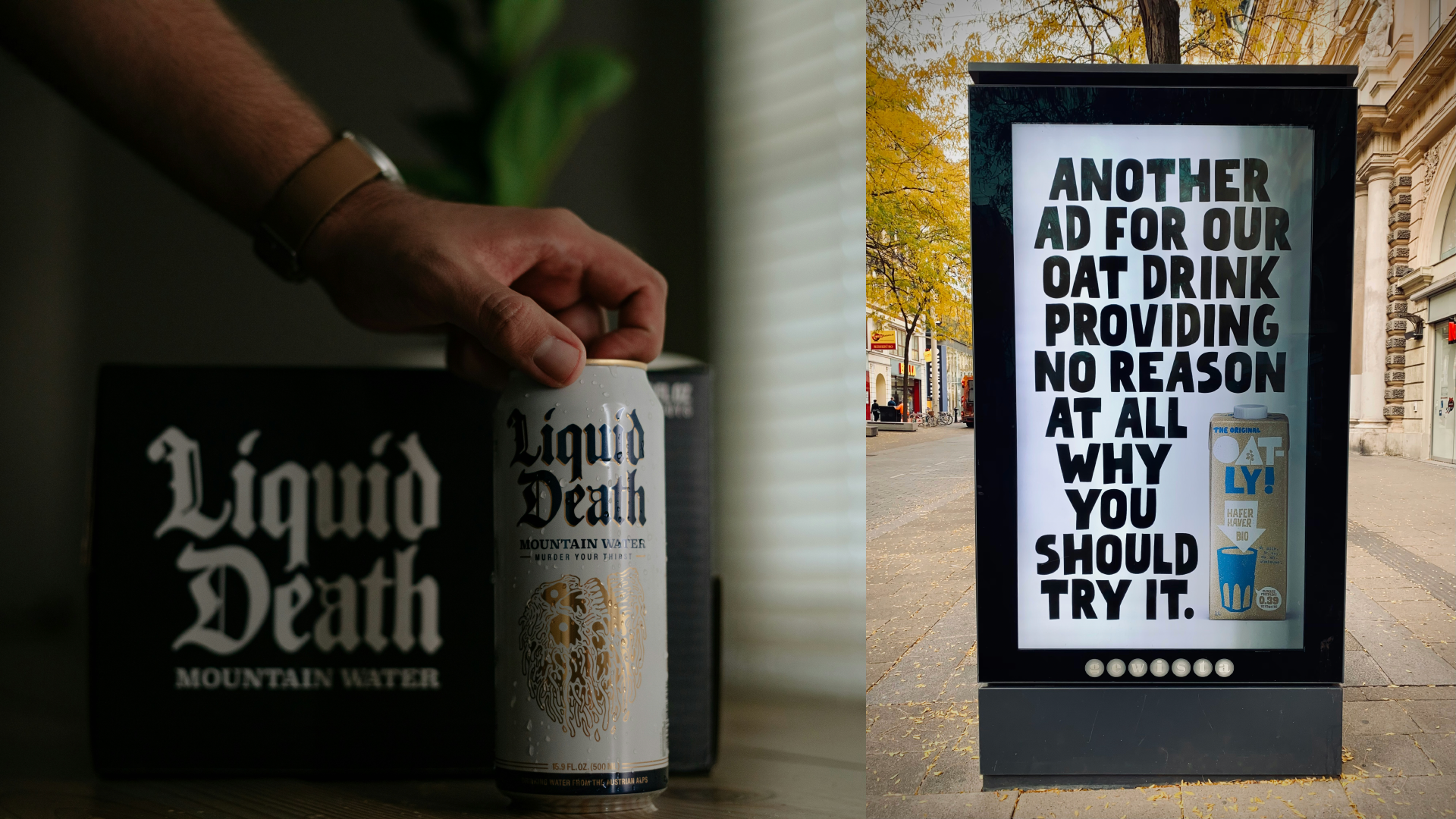
Then you hit on something that makes your insides go squelchy. The brand might not be as loud or as flashy. However, its messaging is clearer. You see it and you can feel it. The difference.
Oatly went, efff you dairy, this is my patch.
Monzo made a debit card you can spot from the moon.
Liquid Death took water and dressed it like you were having cans down the park.
These were conscious decisions, someone made a call and followed it through because they believed in it but also they felt they needed to disrupt. Anarchy rules. Visually different, tonally different, behaviourally different from what had gone before and all those decisions pulling in the same direction.
Mundanity was not on the radar for these companies. As David Bowie put it, “I don’t know where I’m going from here, but I promise it won’t be boring.”
If nobody remembers it… what was the point?
Sometimes it’s not the whole brand. It’s a moment that lands. That then feeds into the rest of the brand.
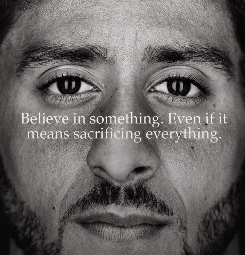
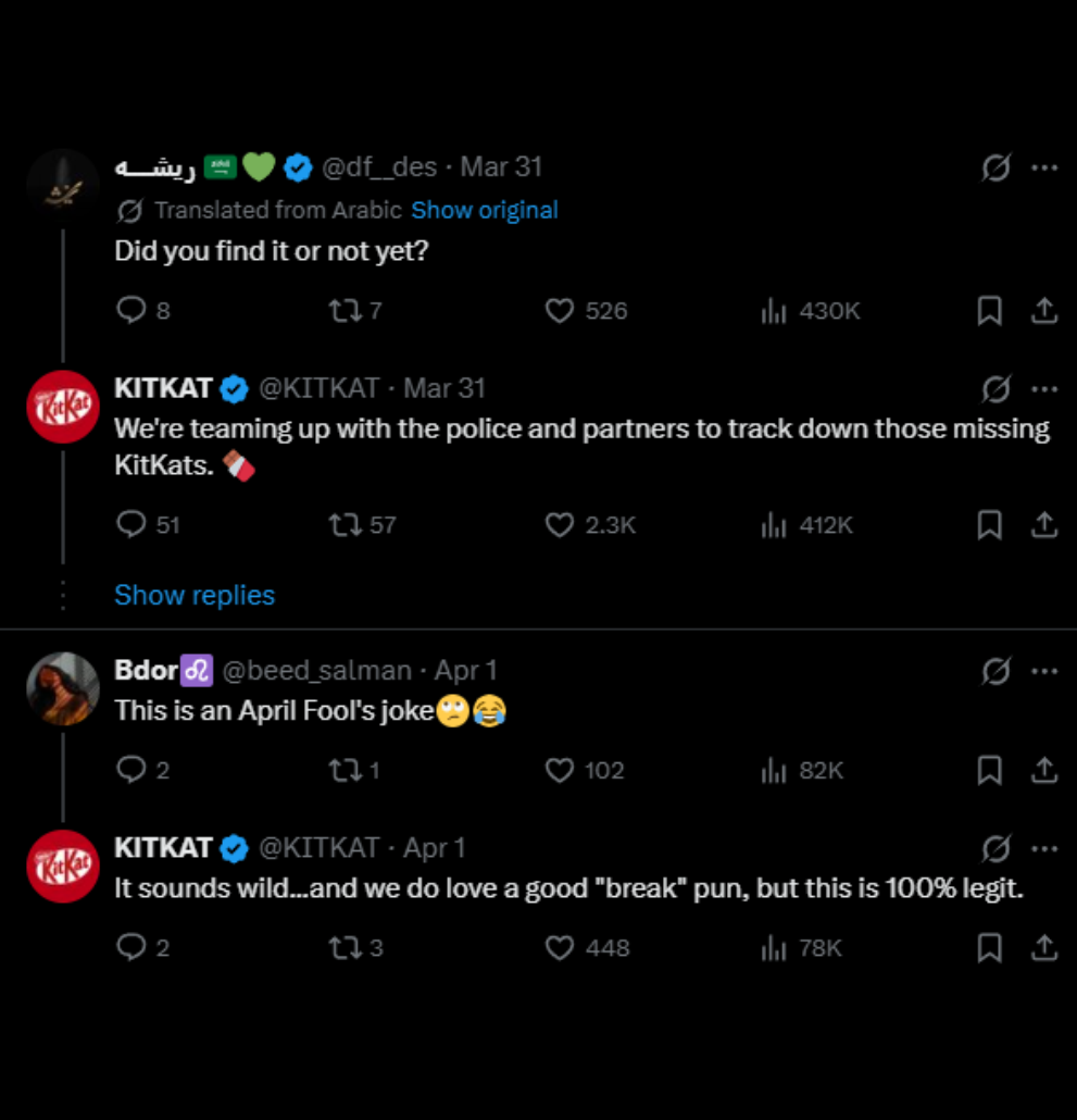
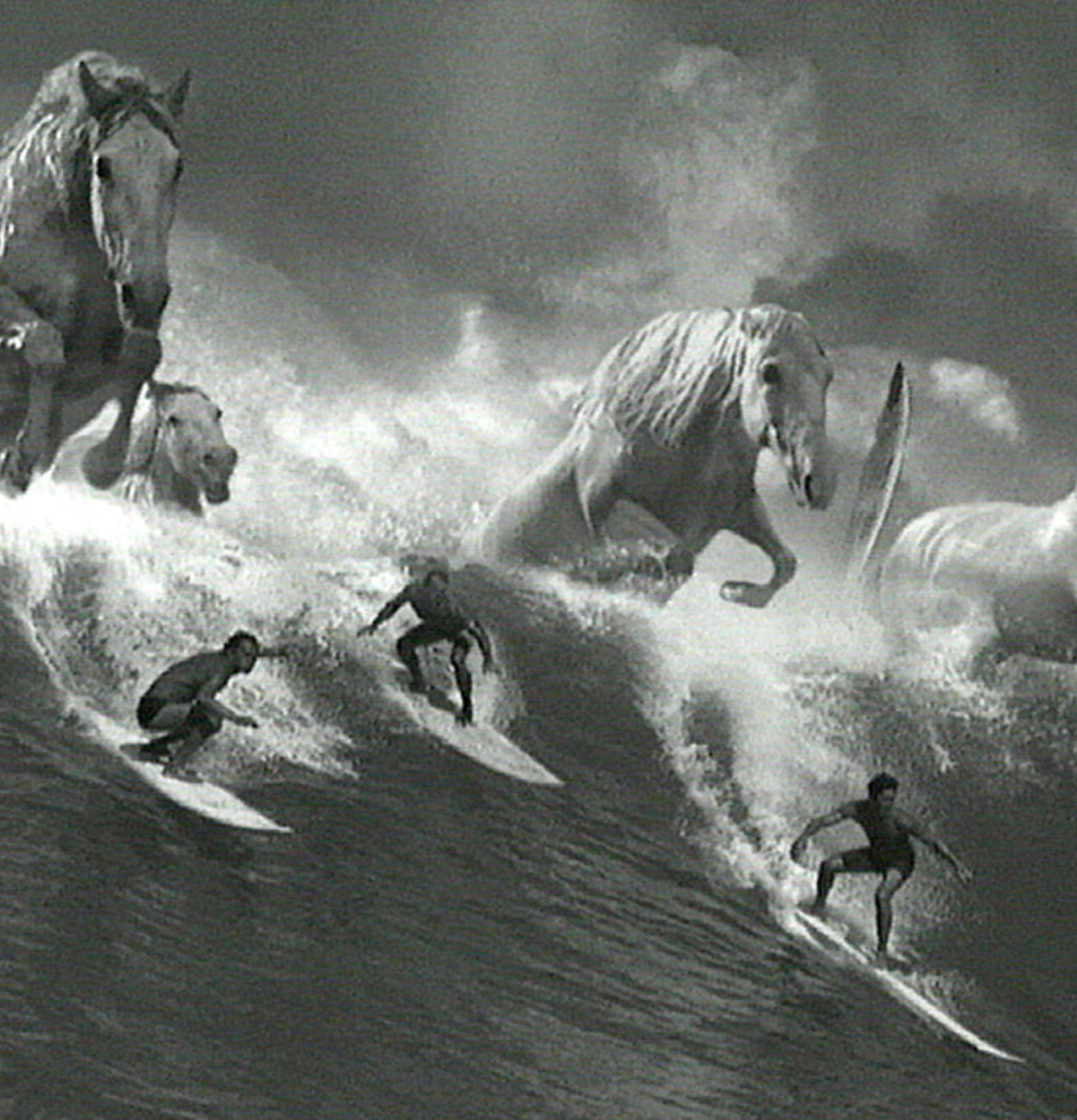
KitKat turned a robbery disaster into a chef's kiss approach to social media. Guinness made surfing a wave to emphasize patience and waiting for the perfect moment. Nike backing Colin Kaepernick and letting the reaction happen.
These moments work because they don’t feel watered down. No sense of someone stepping in at the last minute to make it safer. The idea is clear, the execution holds, and the brand stands.. No one is bending the knee.
Safe is too risky.
Push it further and you get into territory most brands won’t touch.
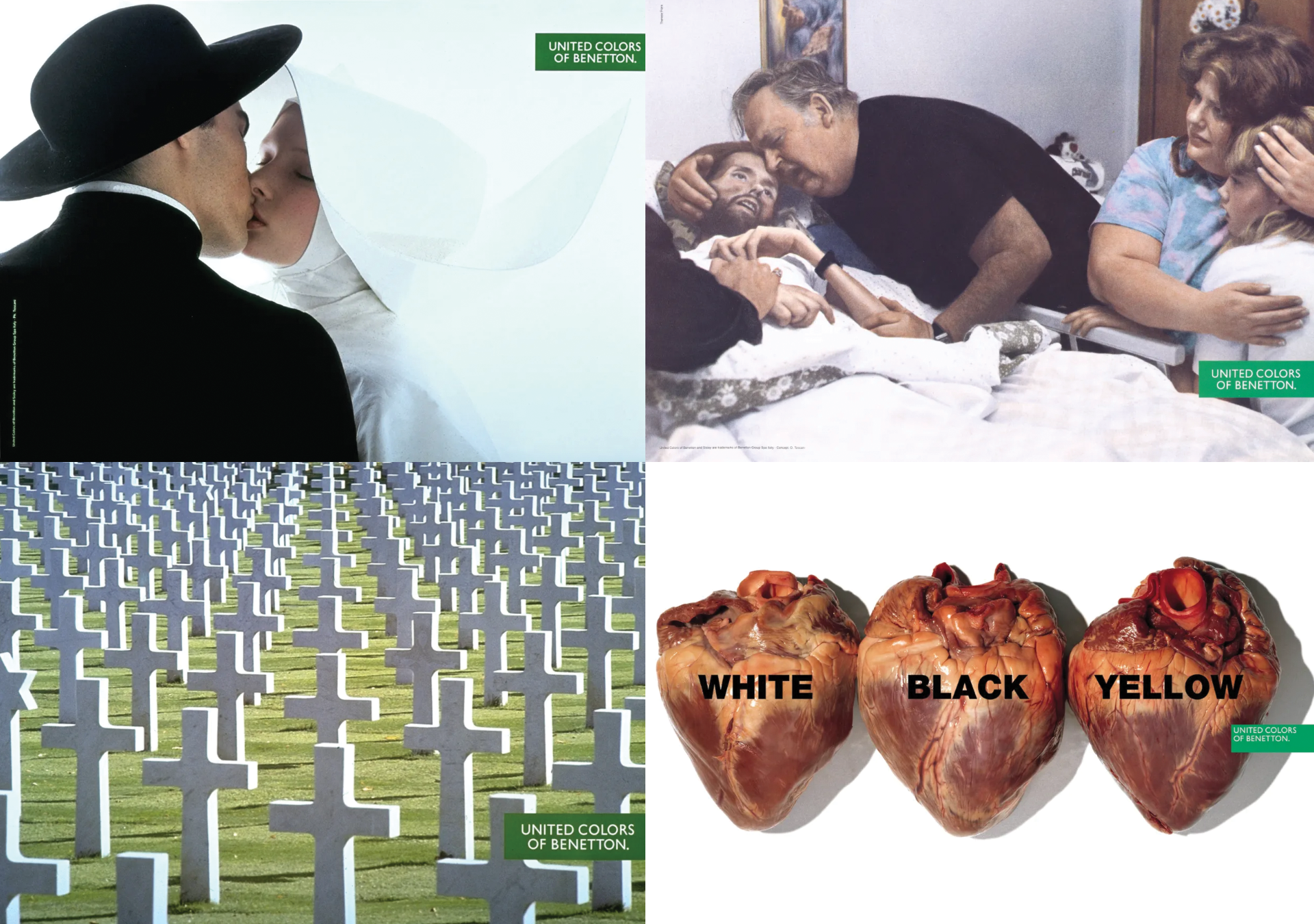
Benetton didn’t just advertise clothes. It put real-world issues in front of people whether they wanted to see them or not. AIDS. War. Religion. No safety net. PETA built entire campaigns around making people uncomfortable enough that ignoring them felt worse. A lot of people didn’t like this work and some of it got pulled. Some of it crossed the line.
But you remember them.
Not because they were shocking for the sake of it, but because they had a point and carried it all the way through.
Then you’ve got the ones that sound like bad ideas when you say them out loud.
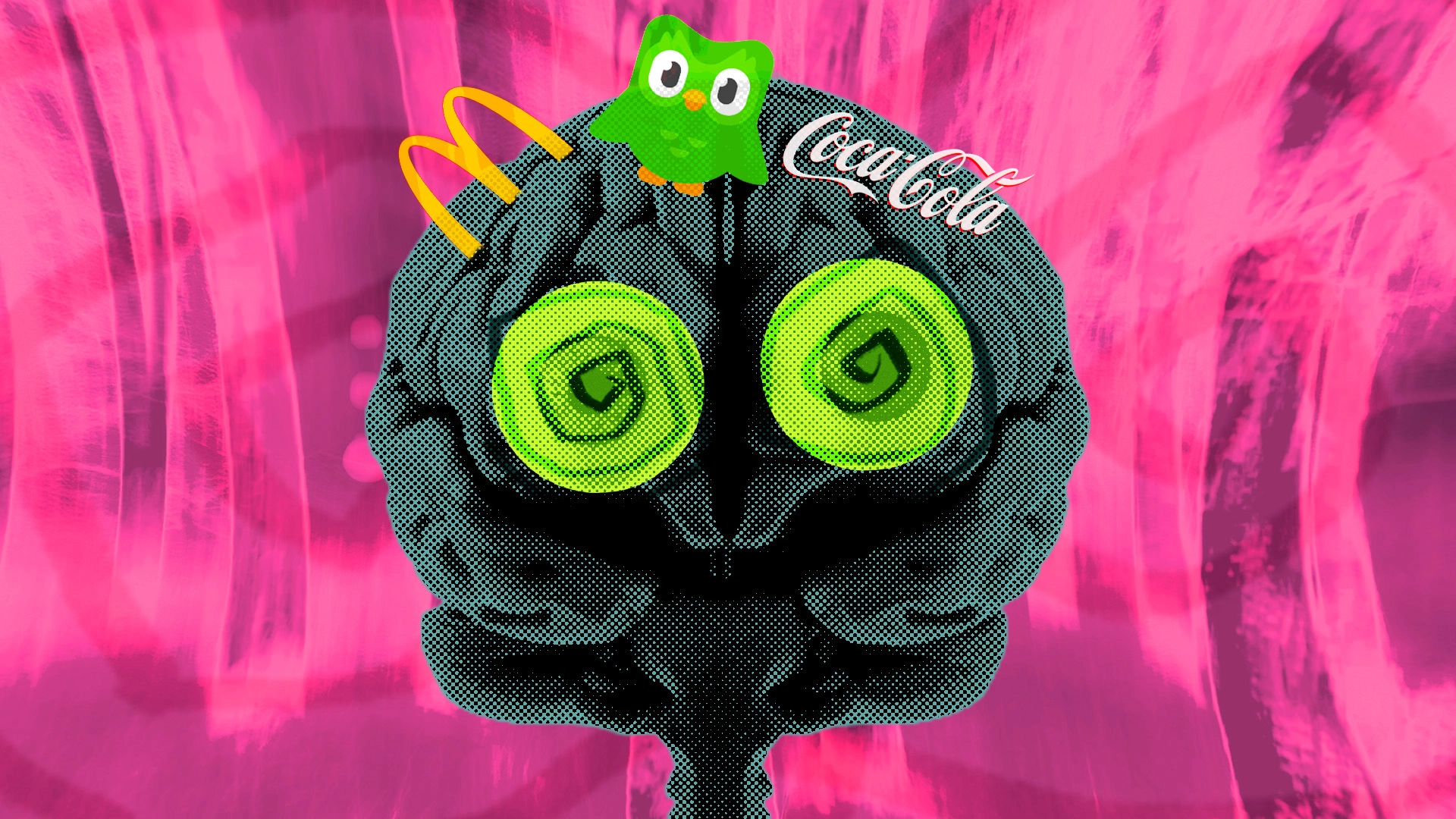
Duolingo turning a green owl into something slightly threatening.
Ryanair behaving like it has nothing to lose.
Old Spice deciding logic is optional. Sexy man on a seahorse anyone?
On paper, none of that should hold together. But it does, because they don’t half do it. They commit.
They’re built to be acceptable. Not memorable.
When a brand does something slightly odd that's when it all kicks off.
It ends up on Tik Tok, Snapchat, X or god forbid LinkedIn. Everyone has an opinion for about 48/72 hours.
Take the recent stuff:
• KitKat leaning into that whole robbery story
• McDonald’s putting their CEO on camera eating the food
People shared it.
People joked about it.
People questioned if it was staged.
Other brands hopped on it and did their version.
X was a happy place for once.
It worked because it created a reaction. Your little grey cells got all excited and bounced around thinking, “Hang on… is that real?” That moment of hesitation is all that was needed. After that, people did the work. They shared it. They commented. They argued over it.
You don't need a massive idea, you need an disrupter to the scroll. "Disrupter to he Scroll" that should be band name.
Now, this creates attention but it doesn’t build the whole identity. Once that moment passes, what’s left? If there’s no recognisable system behind it, the answer is usually: nothing much.
No colour you associate with them. No layout you’d spot out in the wilds. No tone that carries weight.
The brands that disappear are too careful. Everything is smoothed out so nothing causes a reaction. The brands that stick do the opposite. They make a call and push it far enough that it becomes theirs. Definitive in who they are.
And then they repeat it until you never forget it.
You don’t need to shock anyone. You don’t need a viral moment. But you probably do need to stop playing it this safe.
A simple way to check it:
Take your logo off everything.
What’s left?
Do your colours give you away?
Your layouts?
Your tone?
Or could it belong to anyone?
If it could belong to anyone, it will be remembered by no one.
Would they remember you tomorrow?
If the answer is no, it’s rarely because the work isn’t good.
It’s because there’s nothing there to grab on to.
And that’s not a design problem.
It’s a decision problem.