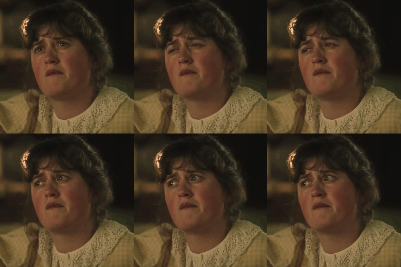
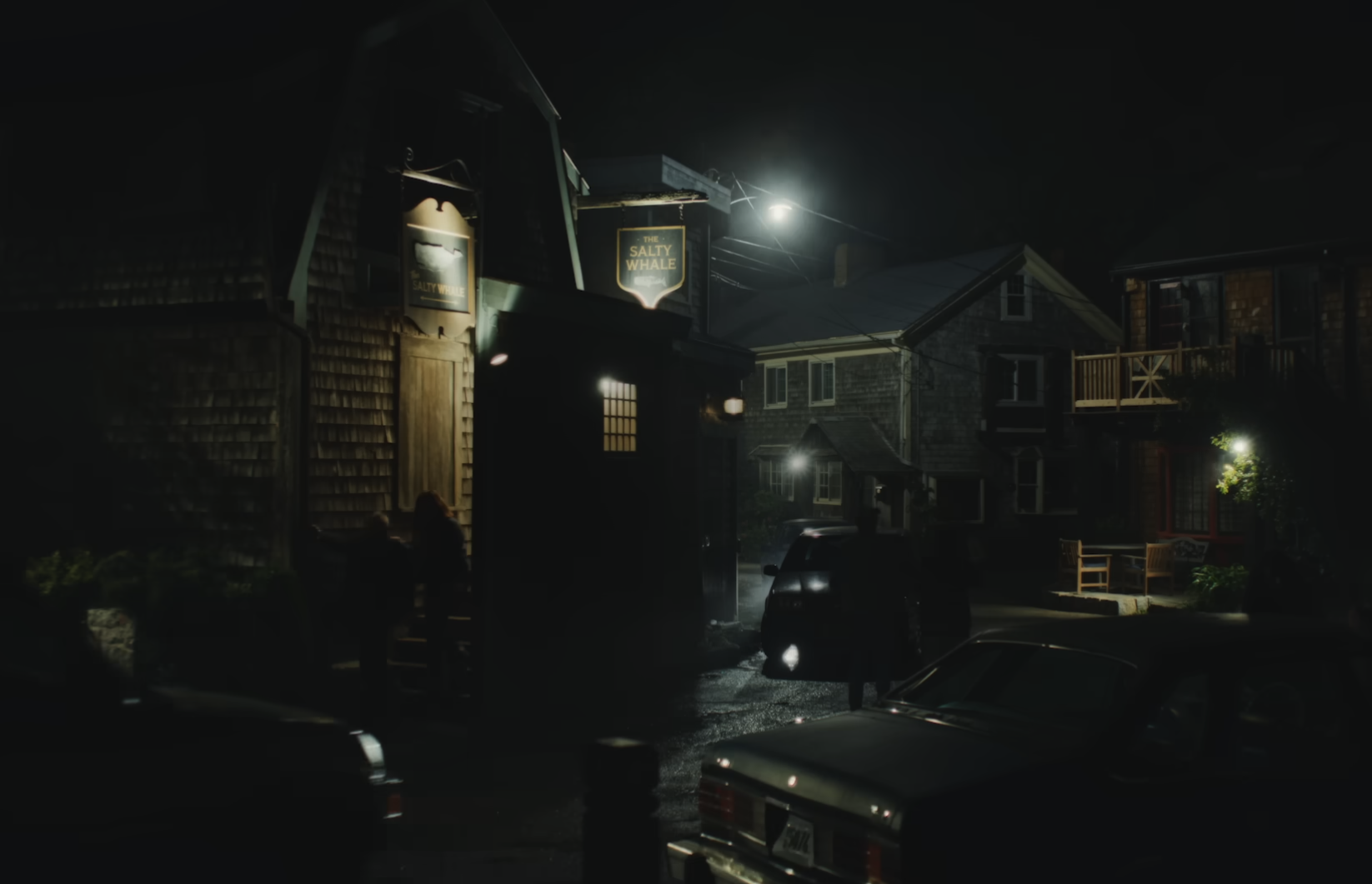
The lighting, colour palettes, framing, typography and production design are all quietly working together to shape expectation. Widow’s Bay does something similar. Without getting into spoilers, the series establishes its atmosphere almost immediately through weathered maritime textures, muted coastal tones and an underlying sense of unease woven through the environments themselves. The audience understands the emotional temperature of the story long before anything is explicitly explained because every visual element is reinforcing the same emotional atmosphere repeatedly.
What is interesting is how closely this overlaps with the way strong brands operate. Businesses often separate logos from everything surrounding them, treating illustrations, photography, motion graphics, iconography and image systems as supporting decoration orbiting around the “real” identity. In practice, most people experience those visual fragments far more often than they experience the logo itself.
The audience understands the emotional temperature of the story long before anything is explicitly explained.
Modern brands are not encountered in controlled conditions anymore. They appear in fragments and partial moments: a social thumbnail while somebody scrolls half-distracted through their phone, a presentation deck projected badly in a meeting room, an app icon sitting among dozens of others on a cluttered screen, a photograph attached to a LinkedIn post or a motion graphic drifting briefly through somebody’s peripheral vision before disappearing again. These fragments accumulate quietly over time and gradually shape perception long before somebody consciously evaluates the business behind them.
That is partly why visual consistency matters so much now. Not because consistency looks tidy in brand guidelines, but because human beings are remarkably good at detecting patterns, atmospheres and contradictions. Audiences may not consciously analyse illustration systems or iconography, but they instinctively notice when visual elements feel disconnected from one another or emotionally at odds with the thing they are supposed to represent.
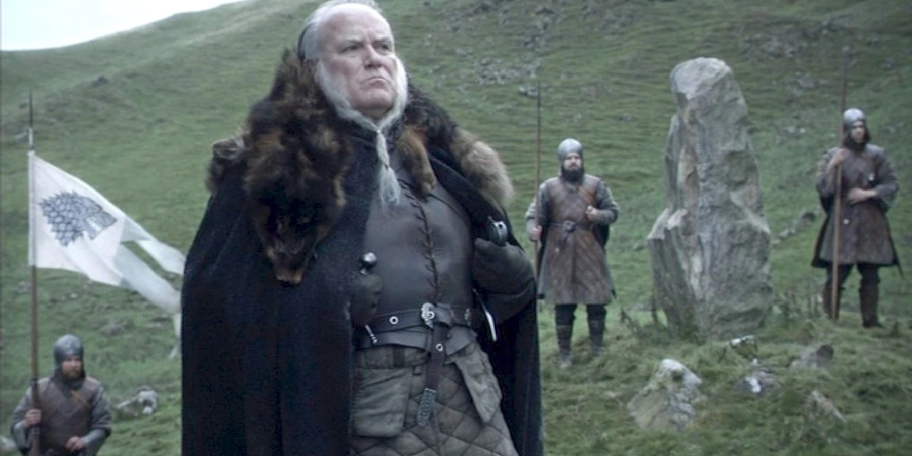
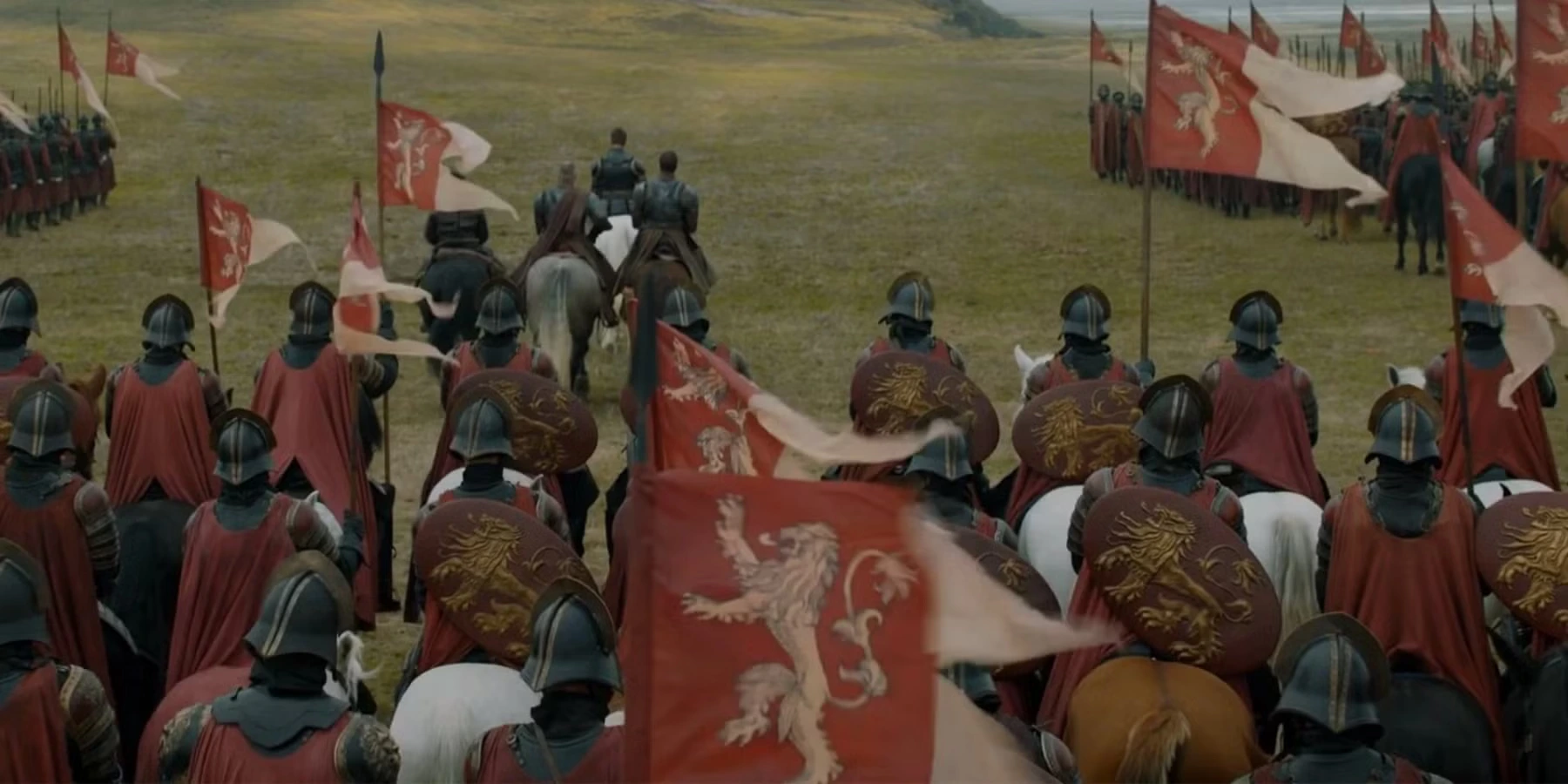

You can see this very clearly in Game of Thrones. The houses within that world are essentially fully formed identity systems. Long before characters explain their allegiances, the audience already understands something about them through sigils, colours, armour and environments.
House Stark’s grey direwolf and cold, muted palettes reinforce restraint, survival and the harshness of the North. House Lannister’s golden lion against crimson banners pushes wealth, power and aggression to the forefront immediately. House Targaryen’s red three-headed dragon on black feels more mythological and dangerous than anything surrounding it, with fire and conquest woven into almost every visual cue attached to the family. None of these systems feel interchangeable. Even without dialogue, you instinctively understand that each house belongs to a completely different world.
That is also why entertainment has become such a useful comparison point for branding. The most recognisable modern shows are not simply well written. They are visually coherent to an almost obsessive degree.
Stranger Things is probably one of the clearest examples of this in recent years. The glowing red typography, slow pacing and synth-heavy title sequence immediately pull from the visual language of 1980s horror paperbacks and Stephen King adaptations. Even before the story properly begins, the audience already understands the emotional territory the show is operating within.

Widow’s Bay does something similar through an entirely different aesthetic vocabulary. The title treatment feels heavily influenced by the visual language of Jaws and older paperback horror covers rather than modern prestige television. The sharp red typography cuts aggressively against pale coastal imagery and washed-out skies, creating a strange tension between nostalgia and unease.
Even before the story properly unfolds, the logo is already signalling folklore, mystery and something slightly unnatural sitting underneath an otherwise ordinary seaside town. Both shows are using visual shorthand to trigger recognition and atmosphere long before plot or dialogue properly take hold.
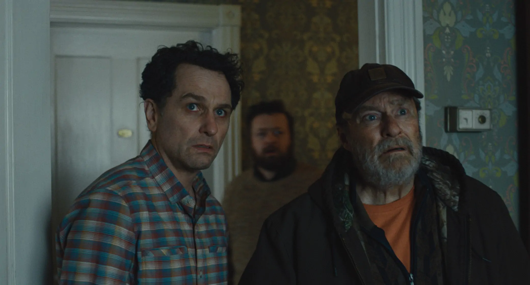

Even before the story properly unfolds, the logo is already signalling folklore, mystery and something slightly unnatural sitting underneath an otherwise ordinary seaside town.
Many brands, on the other hand, still treat visual assets as interchangeable filler. Generic illustrations are dropped beside text because empty space feels uncomfortable. Motion graphics are added because movement signals modernity. Stock photography appears disconnected from typography, while icons belong to an entirely different visual system again. Individually, none of these decisions feel catastrophic, but together they weaken recognition because they fail to build a coherent atmosphere around the business itself.
That is usually why certain brands feel strangely forgettable even when the underlying service is perfectly competent. The visuals are not reinforcing anything consistently enough for the brain to build familiarity around them. Everything looks designed, but very little feels intentional.
Strong visual systems work differently. Photography carries emotional tone. Illustration styles reinforce personality. Motion graphics shape pacing and energy. Iconography clarifies behaviour and meaning. Even texture, framing and spacing contribute to the broader atmosphere people associate with the brand over time.
The strongest visual systems tend to create an atmosphere people recognise long before they consciously analyse it.

Businesses are increasingly operating inside the same visual environment now. Audiences consume highly disciplined visual systems every day through streaming platforms, games, YouTube channels and digital media ecosystems that understand exactly how imagery shapes emotion, expectation and memory. Against that backdrop, weak or disconnected brand visuals stand out very quickly.
That does not mean every business suddenly needs cinematic motion graphics or elaborate illustration systems. It simply means the visual elements surrounding a brand should be reinforcing the same emotional story rather than competing against one another or existing purely to fill space.
When people encounter your business in fragments, are those fragments building recognition or simply adding noise?
Memorable brands are built deliberately.