The logo looked great during the presentation. Everyone nodded approvingly. The mockups were crisp. The website looked sharp. The business cards came out simply lovely.
Then the brand went out into the real world and things started getting a tad bit wobbly.
The Instagram profile picture became unreadable. The favicon turned into a mysterious little blob. The embroidered uniforms lost half the detail. The logo on the van suddenly looked like a completely distorted.
Individually, none of these feel catastrophic but together, they slowly chip away at the consistency of the brand.
That’s usually what people are reacting to when they say:
“Something about the branding just doesn’t feel right.”
A logo used to mainly live on signage, packaging and print. That was more or less the job.
Now it has to survive social media avatars, websites, motion graphics, email signatures, presentations, favicons, dark mode, light mode, giant event screens, van livery, PDFs, social thumbnails and about fifteen other places nobody was thinking about ten years ago.
And people are not carefully studying any of it either.
They’re seeing your brand while scrolling, walking past it, glancing at it from across a room or looking at it through a cracked phone screen while trying to ignore emails on a Tuesday morning.
Not exactly ideal conditions.
That changes how branding has to work.
This is the shift a lot of agencies have quietly moved towards over the last few years.
The logo still matters, obviously. But the strongest identities now are usually built around repeatable behaviour rather than one precious static mark that needs protecting at all costs.
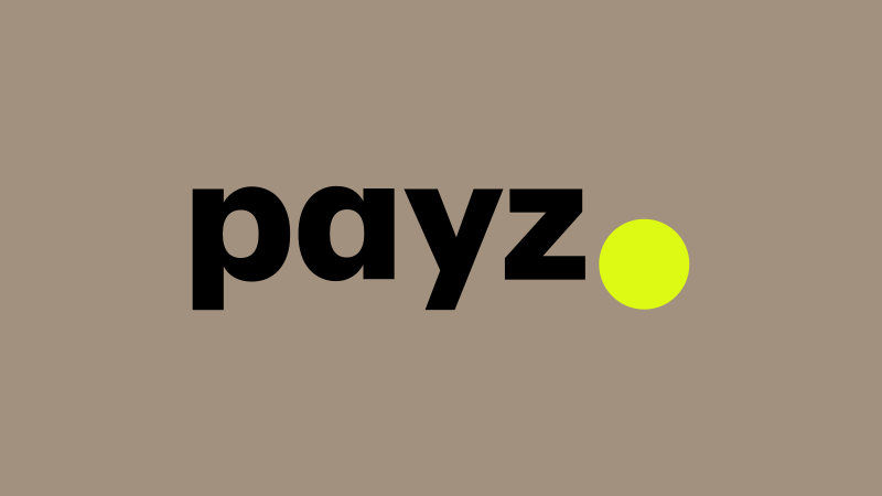
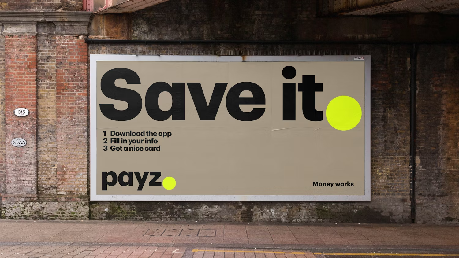
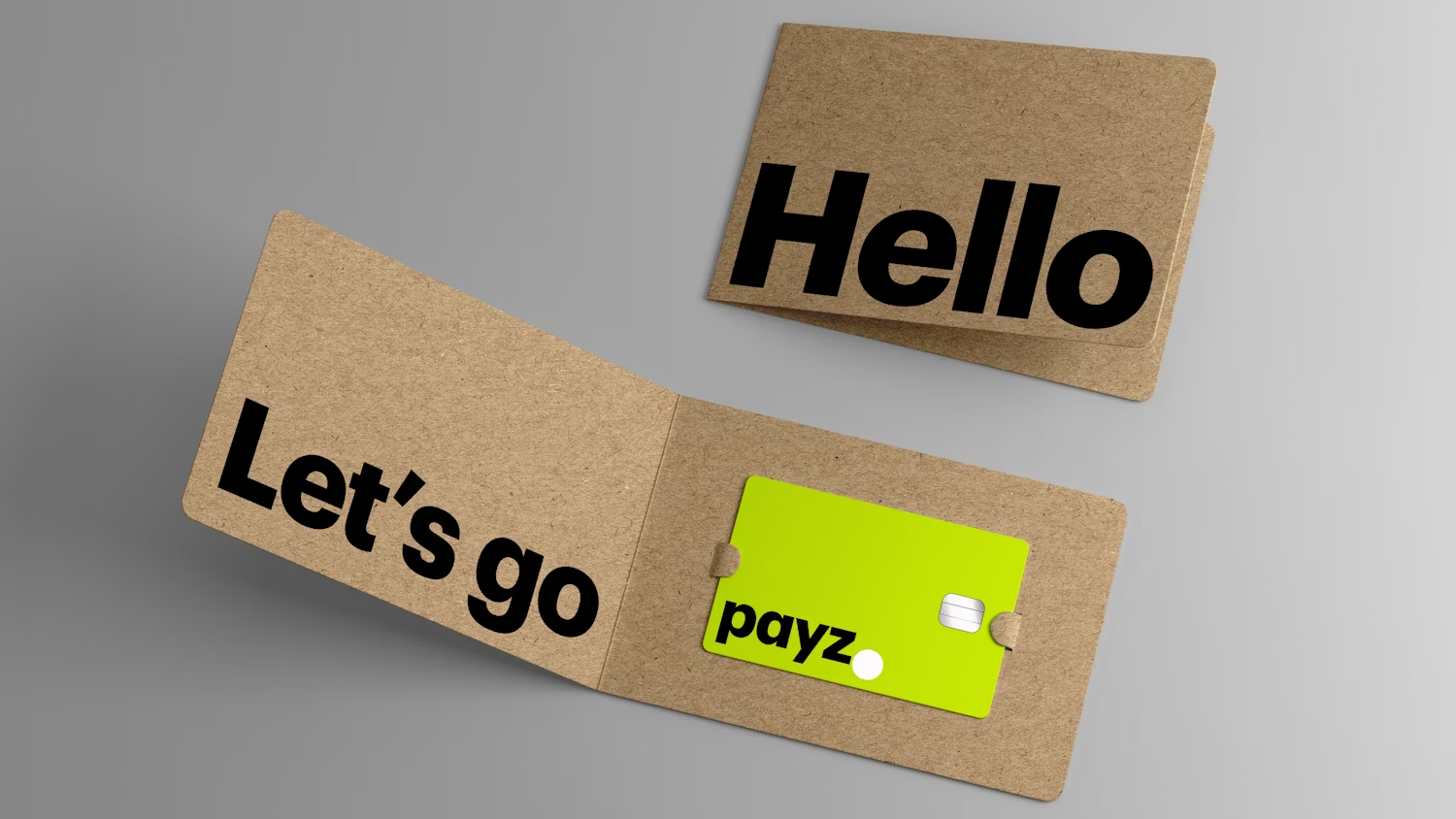
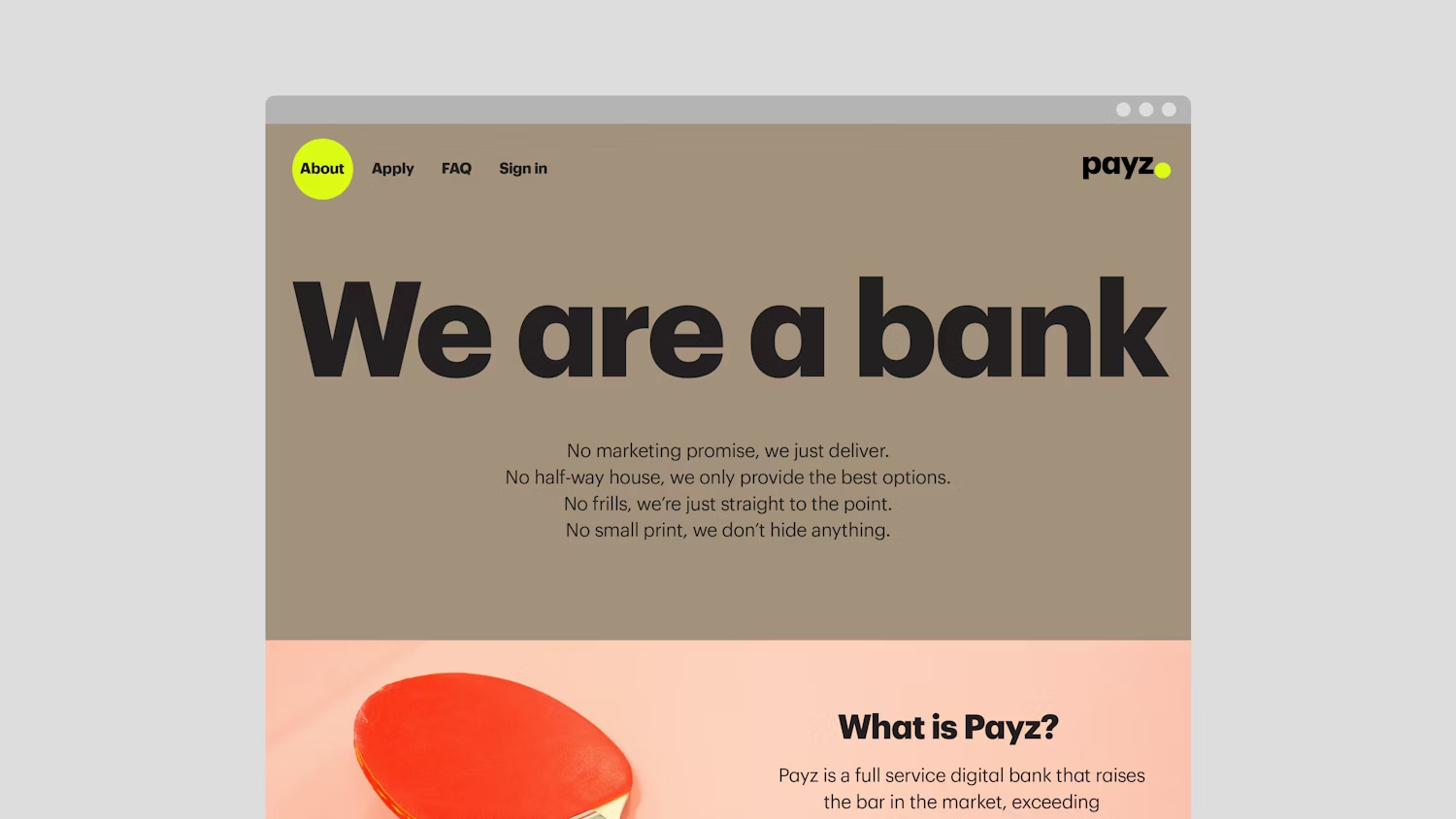
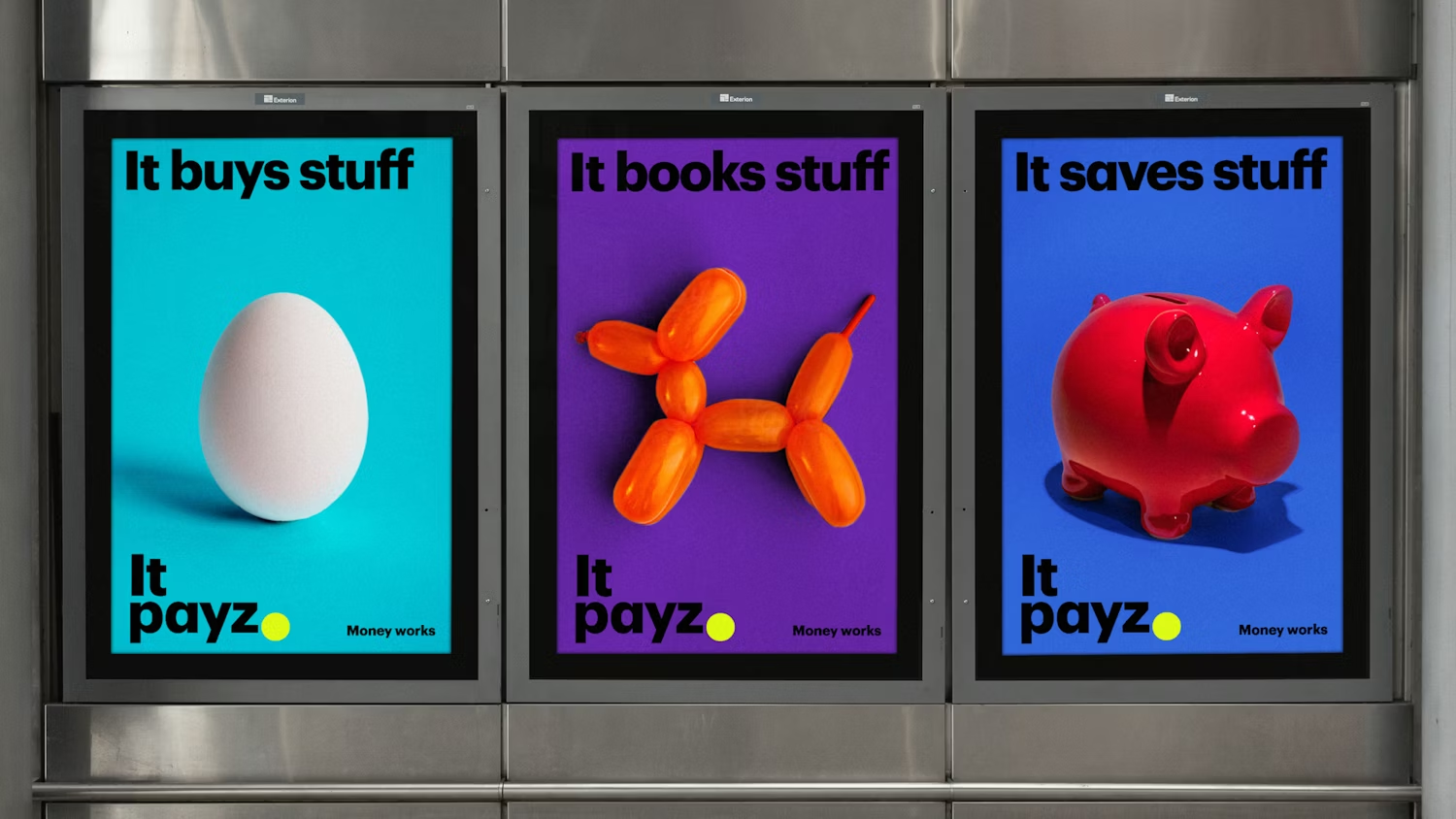
You can see this very clearly in Pentagram’s work for Payz.
The oversized yellow full stop does an enormous amount of heavy lifting across the entire system. It appears inside app interfaces, websites, social graphics, payment cards and UI elements. Sometimes the logo itself is barely present at all, but the system still feels unmistakably like Payz.
That matters because finance brands now live primarily inside tiny digital environments where attention spans are microscopic and logos are often reduced to almost nothing.
The recognition is not coming purely from the wordmark anymore. It’s coming from a repeatable visual device that survives across every touchpoint.
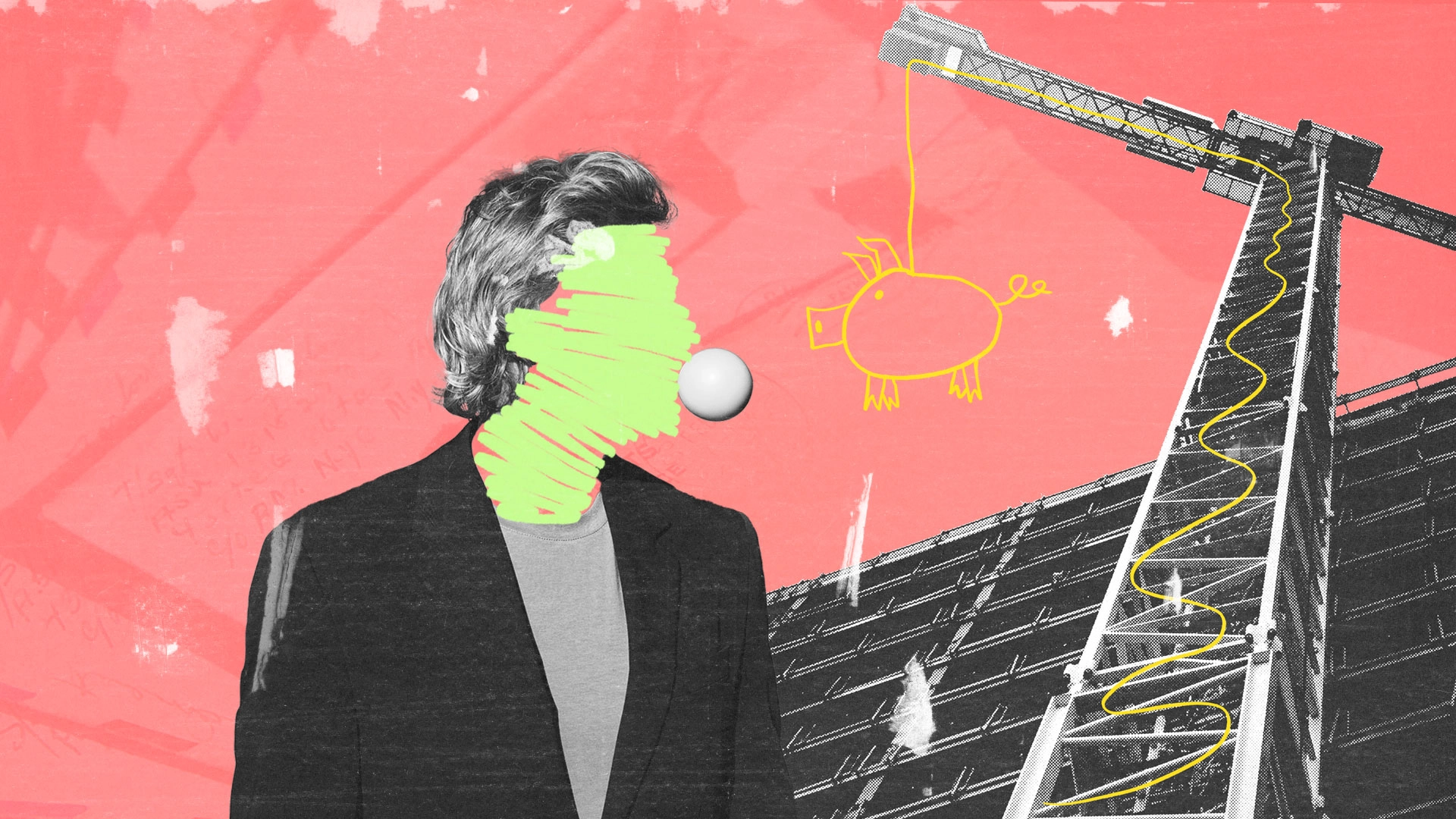
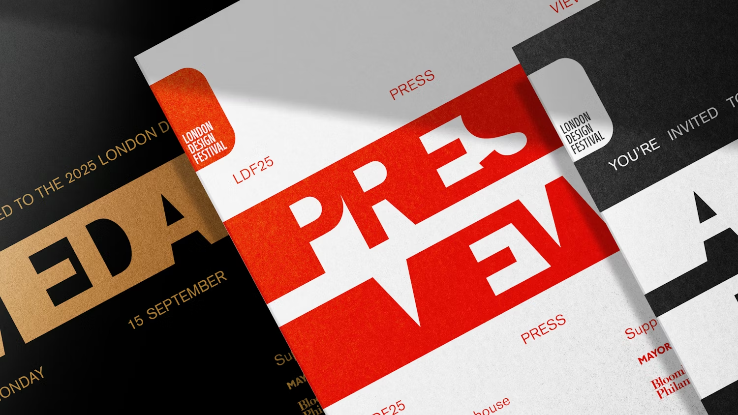
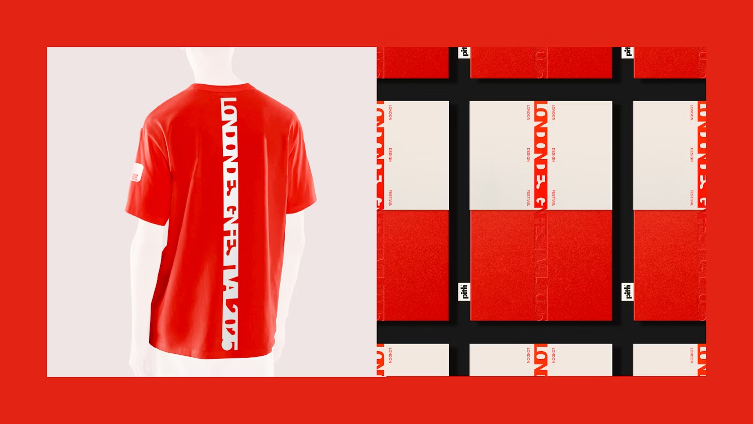
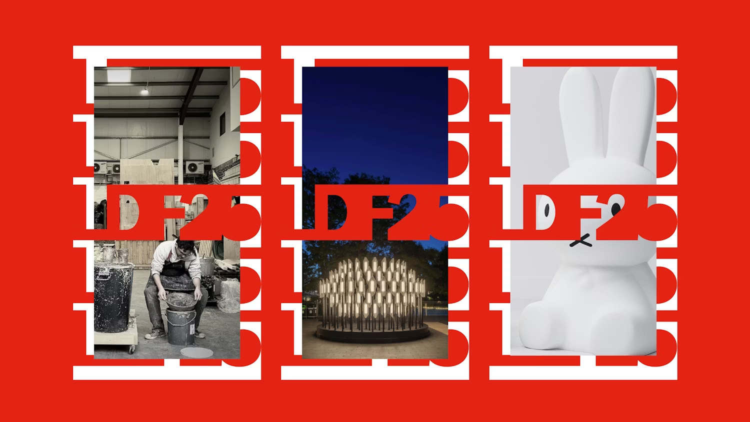
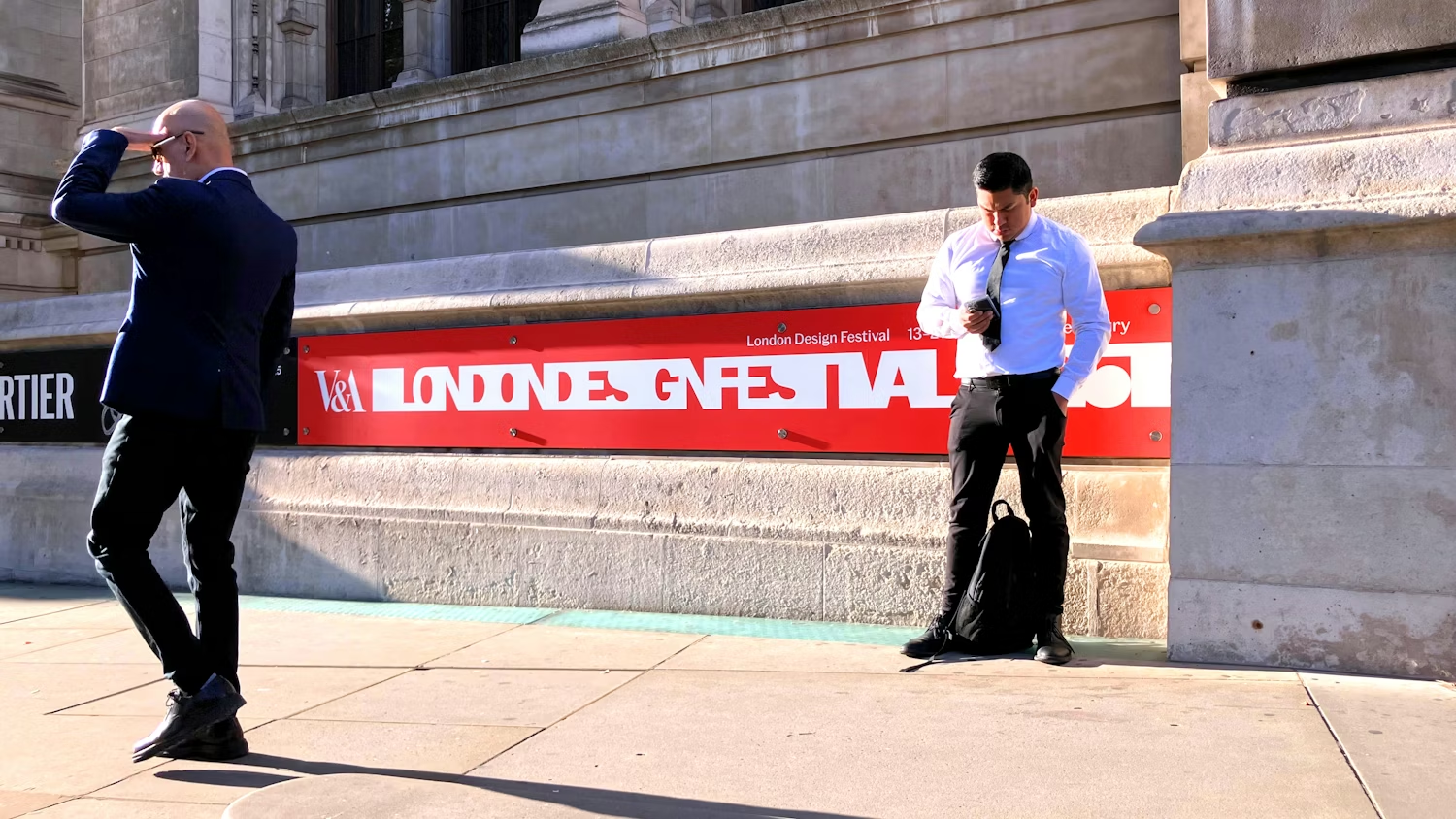
Pentagram’s work for the London Design Festival takes this even further.
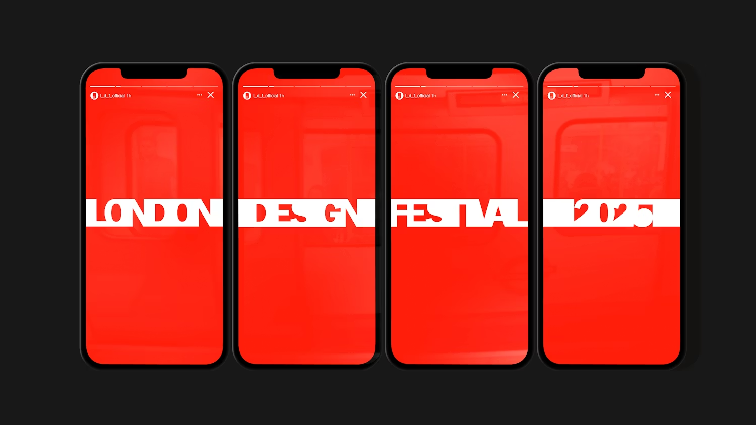
The identity is built around a typographic “thread” system that stretches, contracts, animates, wraps layouts and connects environments together. The clever part is not the thread itself. It’s the consistency of behaviour.
The system can flex massively depending on the application while still feeling recognisable.
That’s why it survives across motion graphics, programmes, social media, event signage, editorial layouts and environmental graphics spread across an entire city.
A static logo alone could never carry all of that.
The system does.
The interesting thing is that most branding problems are not dramatic.
Nobody looks at a slightly inconsistent logo and immediately decides never to trust the company again.
It’s cumulative.
The social profile looks slightly different to the website. The website feels different to the presentation deck. The van signage feels disconnected from the digital side of the business. Small inconsistencies start stacking on top of each other until the brand slowly loses its sense of cohesion.
You see this a lot with growing businesses.
The original identity may have worked perfectly well at one scale, but once the brand starts moving across more touchpoints, environments and teams, the cracks begin to appear.
That’s usually the point where businesses realise they did not just need a logo.
They needed a system.
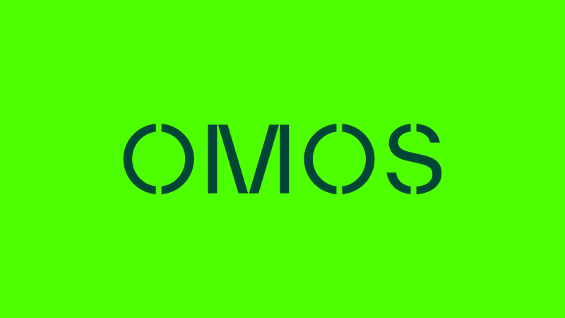
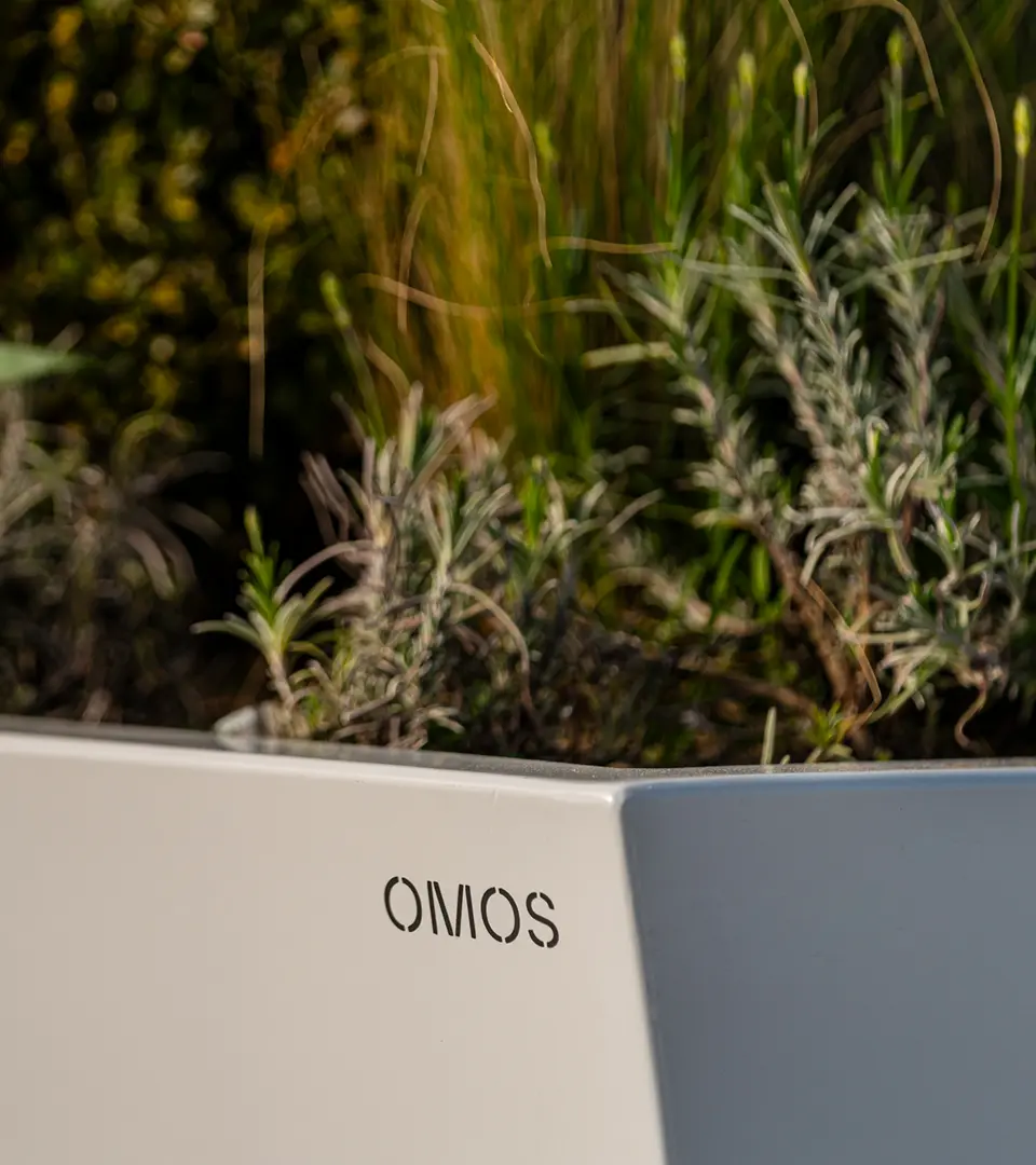
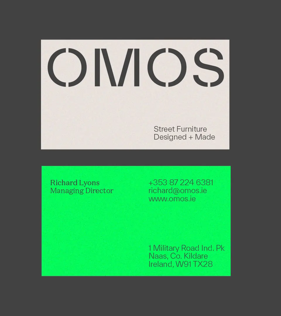
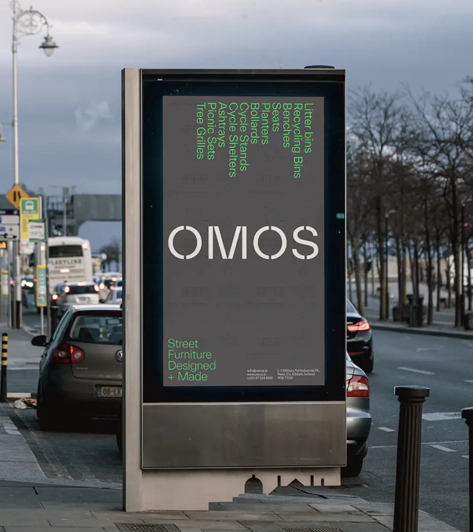
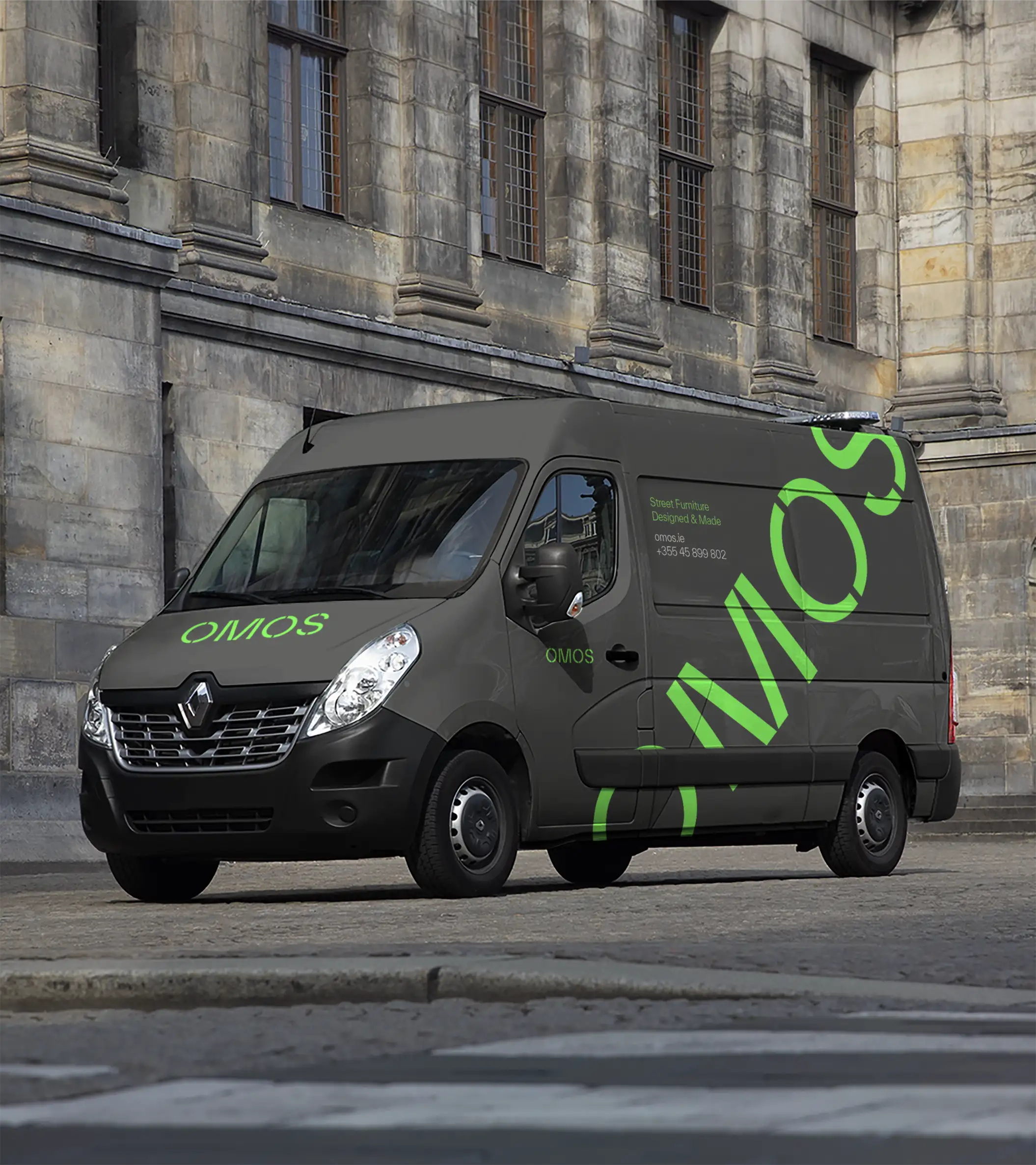
Unthink’s work for OMOS feels grounded in the environments the business actually operates in.
The stencil-inspired typography is not there simply because it looks industrial and cool. The cuts and gaps in the type help the identity survive reproduction, scaling, material application, signage and technical documentation. It feels like something designed to exist on timber, machinery, vans and workwear rather than something carefully protected inside a pristine brand guidelines PDF.
That distinction matters more than people realise.
A lot of branding online still feels designed primarily for launch mockups. OMOS feels designed for actual usage.
This is where people often misunderstand the term.
A scalable identity is not simply:
“Can I make the logo smaller?”
It’s:
“Can the brand survive complexity without losing itself?”
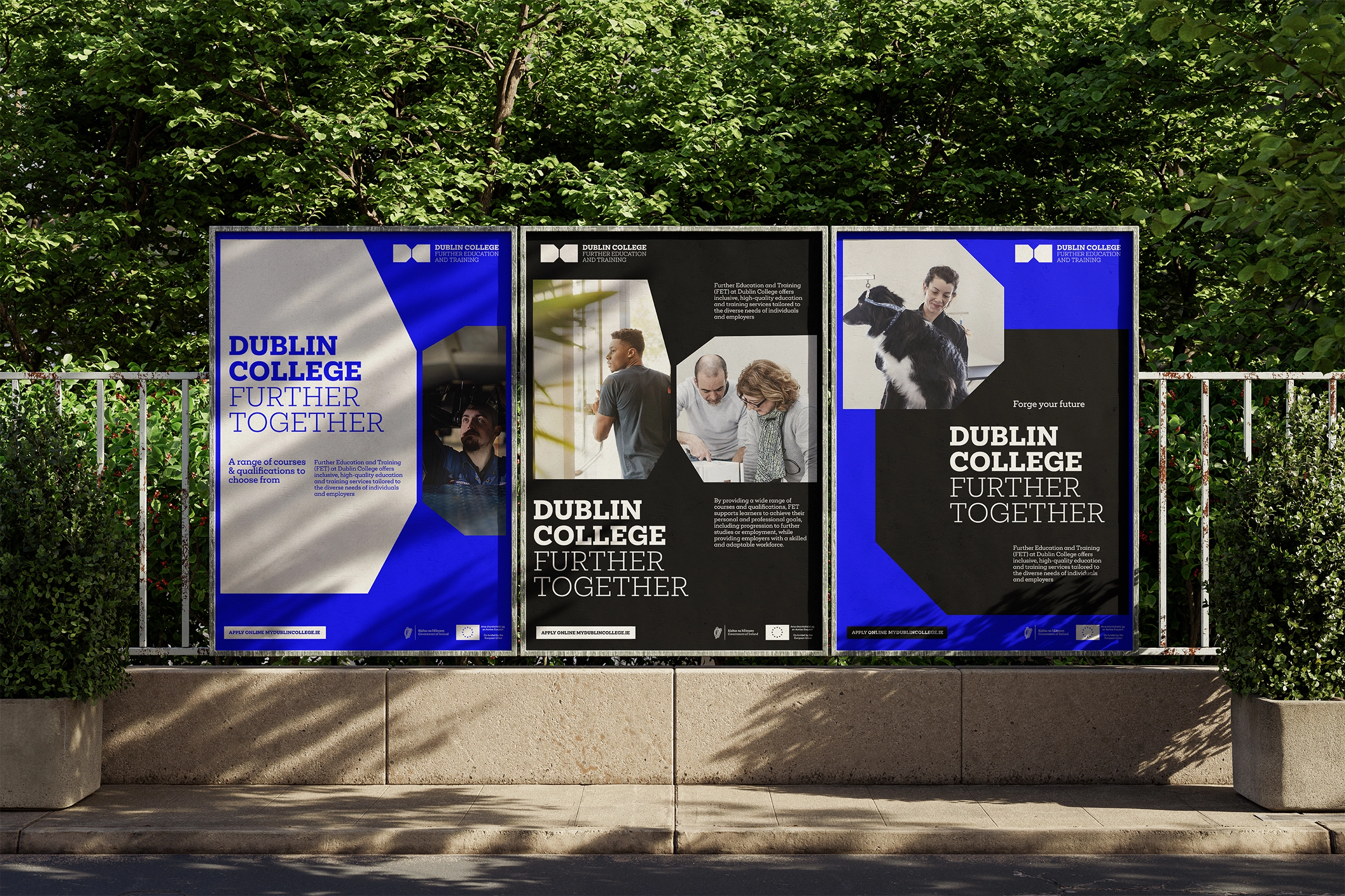
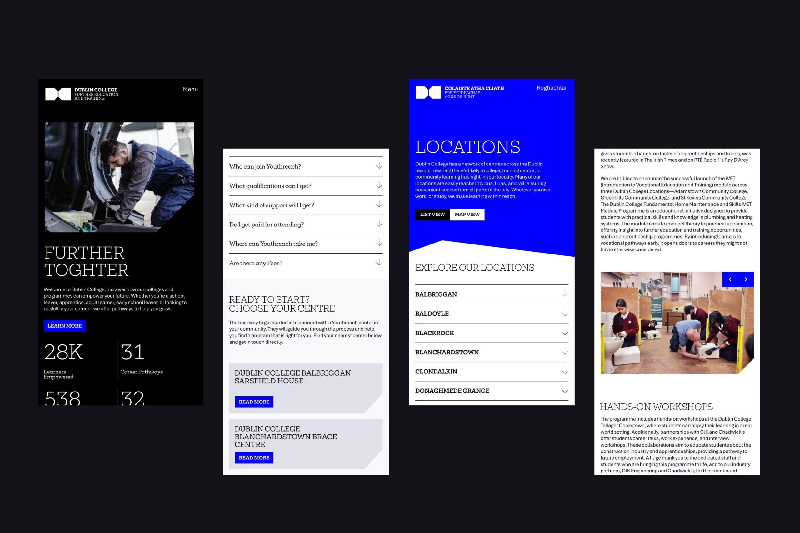
Detail’s work for Dublin College is a very good example of this.
The challenge there was not creating one beautiful logo. It was building a system capable of holding together multiple centres, departments, websites, signage systems, internal communications, print, presentations and constantly evolving digital content.
Each college location receives its own variation of the identity while still remaining visibly connected to the wider system.
That takes an enormous amount of structural discipline.
Too rigid and the system becomes unusable. Too loose and the whole thing fragments.
The strongest identity systems usually sit somewhere in the middle. Flexible enough to adapt. Structured enough to remain coherent.
That’s real scalability.

Too rigid and the system becomes unusable. Too loose and the whole thing fragments.
The strongest modern brands are no longer built around one perfect logo.
They’re built around systems. Typography. Layout behaviour. Motion. Scalable devices. Environmental applications. Repeatable visual patterns.
The logo still matters.
It’s just no longer expected to carry the entire weight of the brand on its own.
And honestly, that’s probably a good thing.
Does your logo actually work everywhere your brand exists?
Or have you only seen it in perfect conditions?