If you're starting something tomorrow morning, you don't need a logo. I know this sounds a bit counter intuitive, but it really isn't.
Starting off you need something that stays the same so that when it's around long enough people recognise it.
Plenty of businesses you recognise now didn’t begin with a polished identity. I know mine didn't.
They began with the same name, used the same way, repeated until it stuck.
Most early businesses redesign too early.
Not because they need to. Because they’re unsure.
Unsure of who they are for, how it speaks and where they going?
The business is still figuring out what it is. Why are my rates so high? What's a tax bill?
Changing the logo feels like progress. But it doesn’t fix uncertainty. It just gives it a new surface.
A different shade of blue is not going to get Mabel to buy whatever stuff you're selling.

Running is an abomination to my mind.
This is very important context.
Strava didn’t convert me through branding. It converted everyone else through behaviour.
You don’t know someone uses Strava because of the logo.
You know because they’ve sent you a link.
Or posted a screenshot.
Or said, very casually, “here have a look at my Strava.”
It's never said casually and I hate your orange lines.
Strava doesn’t spread through design. It spreads through ego, splits and screenshots.
Nobody ever posts a bad run.
There’s always a disclaimer.
“Easy one.”
“Nothing major.”
“Just ticking the legs over.”
I'm pretty sure they are dying. I would be.
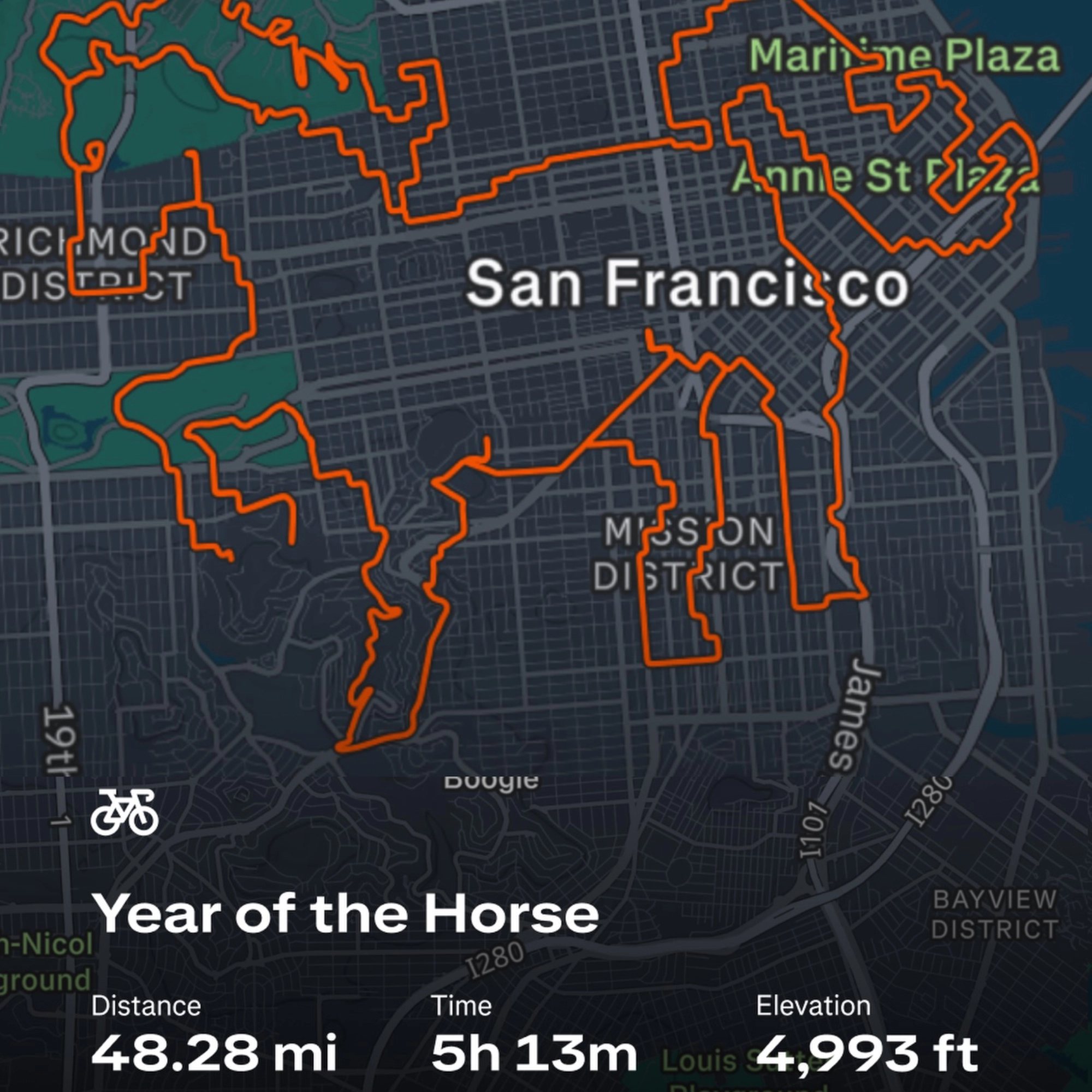
The orange became recognisable because you kept seeing it attached to effort.
To dopamine hits. To joy. To wins, just crossing the line, Sunday morning 5ks.
Distance. Pace. Elevation.
Sometimes triumph.
Sometimes quiet competition over a stretch of hilly road no one outside your postcode cares about.
The colour didn’t create that meaning.
People's repetition did.

Recognition usually forms before identity does
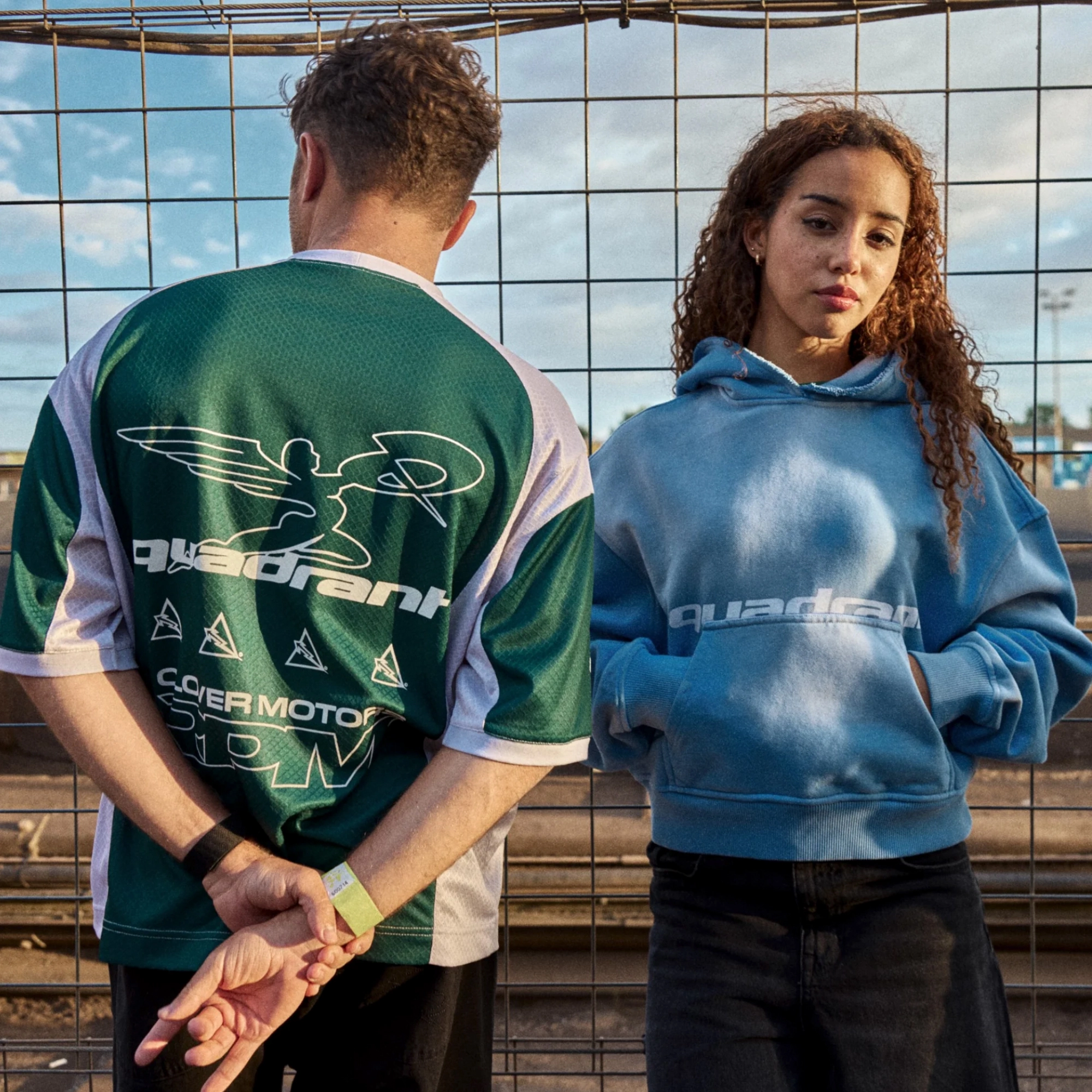
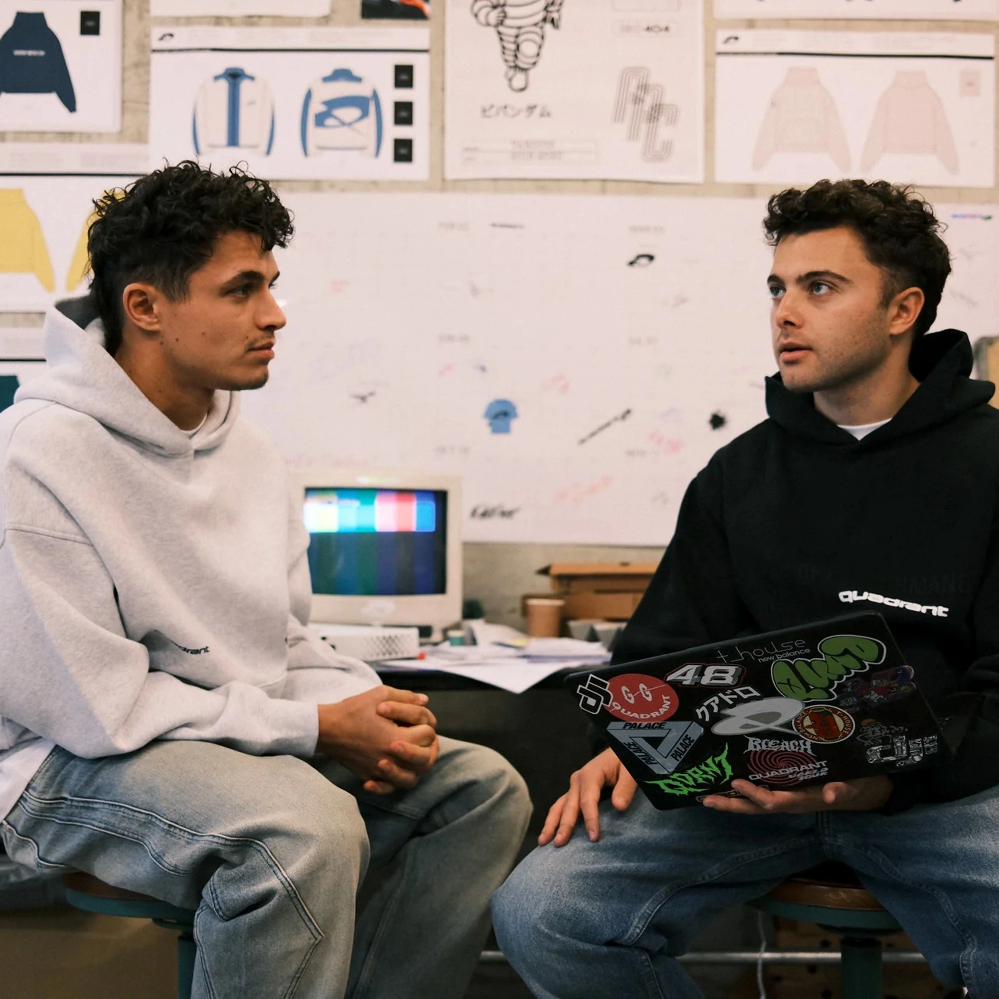
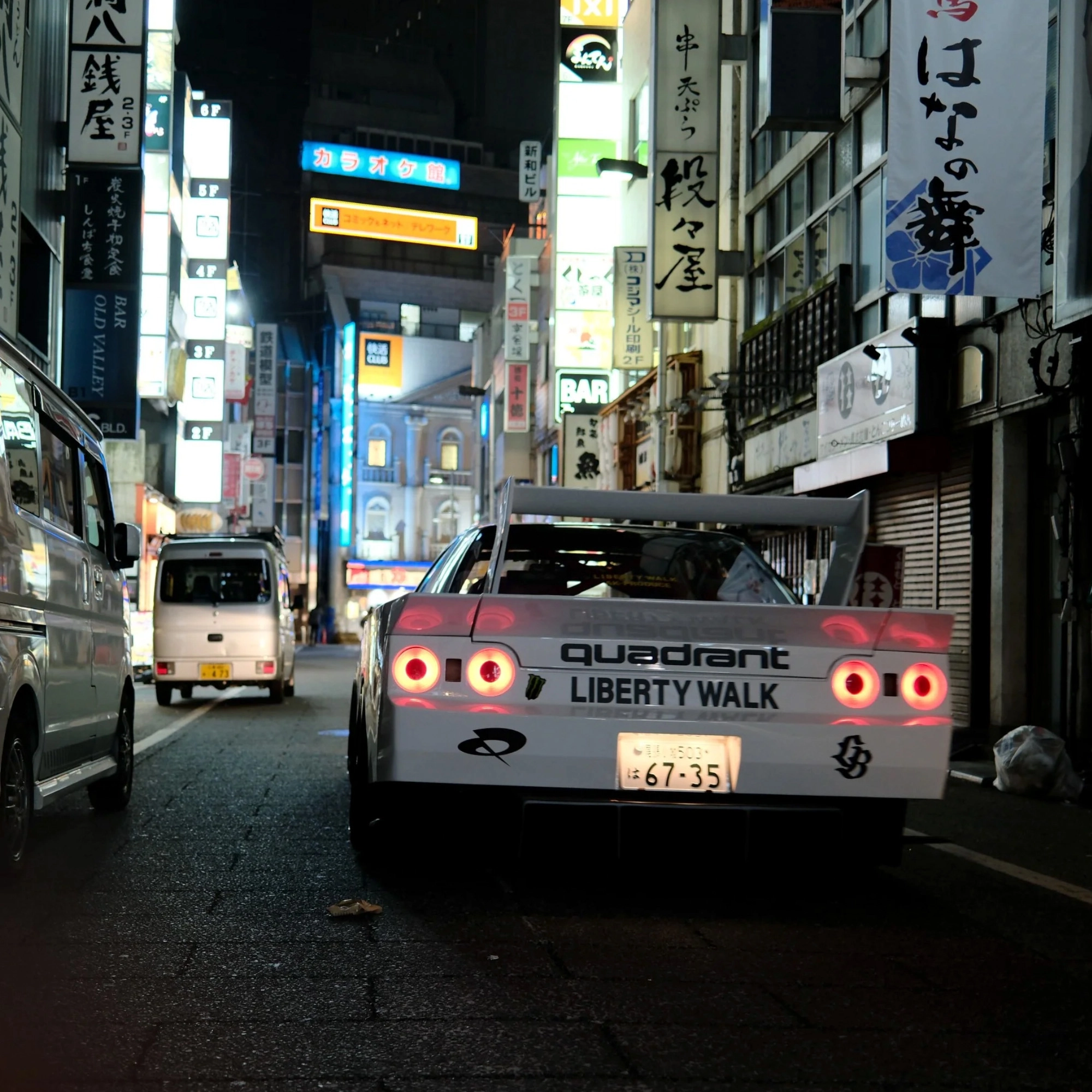
Quadrant followed a similar path.
When it launched in 2020, it was not a finished fashion brand. It was behaviour first. Twitch streams. YouTube videos. Sim racing.
A tight group of creators showing up consistently and not taking themselves too seriously.
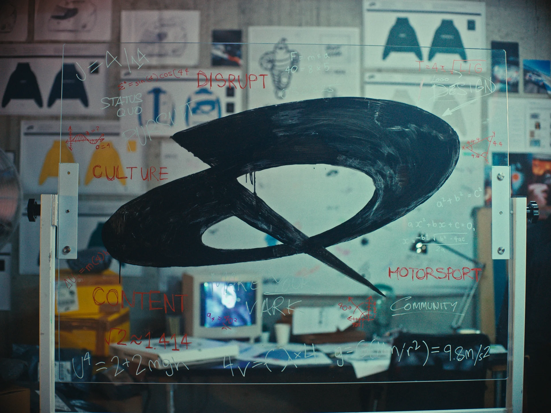
Slow energy vibes in a fast world.
It disrupted the usual motorsport playbook without announcing that it was doing so. No polished unveiling. No heritage posture. Just momentum.
The clothing and visual system sharpened later. By then, people already knew what Quadrant was.
Having Lando Norris on board probably helped a tad too.
None of the companies mentioned relied on a logo to introduce themselves. They relied on repetition. Familiarity. Stability. Through what they are giving you as a company.
You saw the same thing more than once. That’s what made it recognisable and desirable. Down the line they increased that desirablility.
You see the same patterns elsewhere.
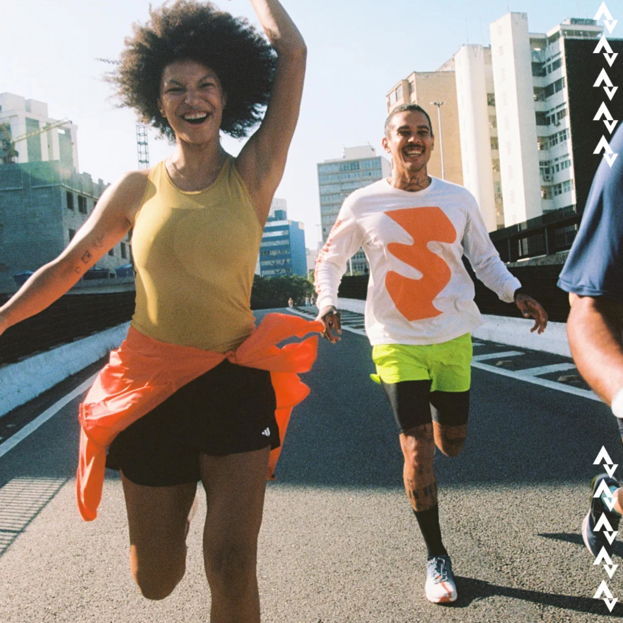
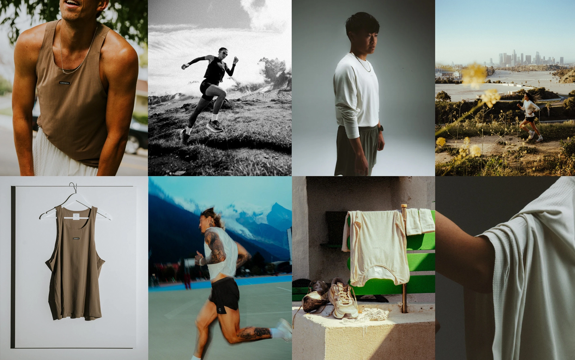
Currently Running is one of those brands.
There’s a series of icons (I've no great love for them) and a system that's very coherent.
But what makes it recognisable isn’t the icons. It’s the restraint around them. God I love it.
Same tone. Same placement. Same decisions repeated long enough to stop looking like decisions.
Movement is a constant. Even in a still image, on the hanger ready to go, the run has been done or the material floats.
You could remove the icons entirely and it would still feel like itself.


Most brands break themselves by changing too often.
You see it constantly.
New logo. New colours. New direction.
Usually because the thing underneath hasn’t stabilised yet.
They’re trying to solve it from the outside.
It doesn’t work like that.

Branding becomes useful when the business becomes clear.
Not before.
When the offering stabilises. When the direction stops shifting. When you’re no longer guessing.
Branding doesn’t create clarity.
It preserves it.
Repetition, repetition, repetition, repetition is what will make your brand stick.
If you're starting tomorrow morning:
Use your name.
Write it the same way every time.
Use the same email address. Same profile image. Same tone.
Don’t redesign it every week.
Let people see it more than once.
Once the business stabilises, once the direction becomes clear, once people start recognising it without effort—
That’s when your brand identity becomes useful.
It doesn't invent the recognition.
It makes people hold onto it.
You can’t design clarity into something.
You can only recognise when it’s already there.
All images and icons are the ownership of their respective brands.